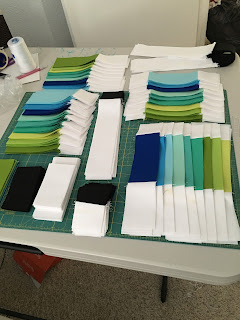
So. Much. Cutting. There are a lot of pieces that go into this quilt, but I think it was worth it. I chose to use all solids for this quilt--again to give it a very classic look. I used all Kona cottons for this top.
A progress picture.
Much more progress. This is when all the subunits to make the blocks were done. I have never, ever used my seam ripper as much as I did with this quilt. I wanted to make it as perfect as possible.
The quilt all laid out and basted. This thing was a beast to get smooth and ready to go. I chose a 108" wide backing--the black crosshatch on white from Doe by Carolyn Friedlander. It was kind of unwieldy to have such a large piece of fabric but it was so nice to not have to piece a back.
Here it is all quilted. I did it all on my home machine. Man, I just love that Juki. It handled this thing like it was nothing. It's quilted simply with straight lines radiating outwards from the center. I chose this pattern because I would be able to accomplish it and have it look great and also because it would help me with any imperfections in basting. I worked from the center out to make sure everything was smooth and flat.
All done, washed and crinkly and folded. Just like I like it. I love how crisp the bright white and black look together. If anyone was wondering the 9 Kona colours that I used are: cactus, chartreuse, lime, pond, candy green, cypress, robin egg, water and riviera. I love how it turned out but if I were going to make it again I would change either the candy green or cypress to make the contrast higher. The two colours are quite similar. I love how many colours the Kona cottons come in but again, they are difficult to pick just on a computer screen. I really should get a color card.


No comments:
Post a Comment